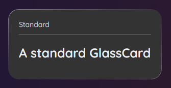
Glass Card
A simple Card control that can present any control inside.
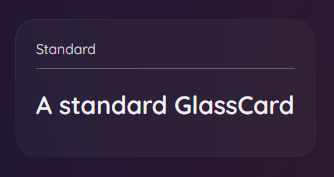
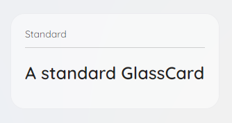
Theme
Dark Theme
Light Theme
xml
<GlassCard>
<!-- Content -->
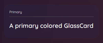
</GlassCard>Alternative Style
Primary
xml
<GlassCard Classes="Primary">
<!-- Content -->
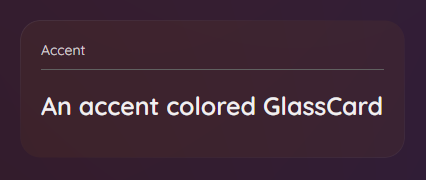
</GlassCard>Accent
xml
<GlassCard Classes="Accent">
    <!-- Content -->
</GlassCard>
Opaque
xml
<GlassCard IsOpaque="True">
    <!-- Content -->
</GlassCard>
Interactive
xml
<GlassCard IsInteractive="True">
    <!-- Content -->
</GlassCard>
Animations
GlassCard are animated with CompositionAnimations by the property IsAnimated set to True by default. Opacity changes and Size changes of the GlassCard are automatically animated.