Button
SukiUI has a handful of button styles, available in both the standard primary color, but also in the theme's accent color.
Styles
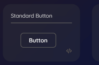
Standard
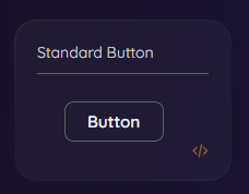
xml
<Button Content="Button"></Button>Flat
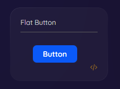
xml
<Button Content="Button" Classes="Flat"></Button>Rounded
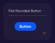
xml
<Button Content="Button" Classes="Flat Rounded"></Button>Outlined
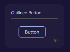
xml
<Button Content="Button" Classes="Outlined"></Button>Basic
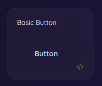
xml
<Button Content="Button" Classes="Basic"></Button>Flat Accent
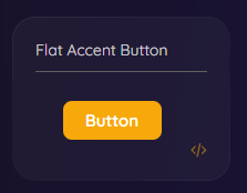
xml
<Button Content="Button" Classes="Flat Accent"></Button>Large
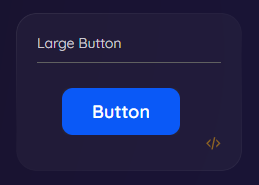
xml
<Button Content="Button" Classes="Flat Large"></Button>Busy/Loading Button
Axaml
xml
...
xmlns:theme="clr-namespace:SukiUI.Theme;assembly=SukiUI"
...

<Button theme:ButtonExtensions.ShowProgress="true"></Button>
C#
Csharp
   MyButton.ShowProgress();

   MyButton.HideProgress();
See Also
Demo: SukiUI.Demo/Features/ControlsLibrary/ButtonsView.axaml